Tokens
Colour, type, spacing, radius and touch targets as semantic roles.
Making AI-assisted inspection faster, clearer and easier for field inspectors with low-to-moderate digital literacy.
Case study thesis
The redesign was not a visual refresh. It was about reducing memory, ambiguity and rework during high-volume vehicle photography, and building a direct feedback loop between inspectors and Quality Control.
00 / Executive summary
An AI inspection app that classifies damage across Exterior, Interior and Tyres, held back by an interface that demanded too much interpretation.
Vehicle Damage Detection analyzes photographs and classifies damage across three capture groups. But for field users working quickly, outdoors, and with limited time to read, the app created friction before the AI could deliver value: unclear categories, uncertain angles, invisible project status, and rejection reasons disconnected from the image that caused them.
The result was abandonment, incorrect submissions, repeated photography, and slower throughput. Users were not failing because the AI concept was unclear. They were failing because the app did not guide them through the work in a predictable sequence.
Similar information looked different across screens, and users were forced to remember what to capture next.
Abandoned or rejected inspections meant more photographer time, more QC cycles, and slower dealer turnaround.
Clear project states, explicit capture categories, visual angle guidance, persistent progress, image-level QC feedback and reusable accessible components.
Task completion rose from 44.3% to 91%, and average project time fell from ~9.4 minutes to ~3 minutes.
01 / Project context
The product, its users, and the field conditions that shaped every decision.
Body, panels, glass, lights and external angles.
Cabin, seats, dashboard and internal surfaces.
Tyre condition, wheel/rim and required close-ups.
Inspectors move around a vehicle, holding a phone, dealing with glare and dealership staff. The interface cannot depend on long reading.
The same capture pattern repeats across many vehicles. Consistency and muscle memory matter more than novelty.
It must work for experienced smartphone users and inspectors less comfortable with complex navigation.
A single unclear image can cause a full QC loop, adding time for both inspector and admin teams.
02 / Problem definition
Turning scattered UI complaints into a single, focused product problem with a clear hierarchy.
Users cannot quickly tell project state or next action.
Category and required angle are not unmistakable.
QC comments are separated from the rejected asset.
Patterns change across screens.
Hierarchy, contrast and tap targets are uneven.
How might we help a field inspector move from assigned vehicle to approved inspection with minimal reading, minimal memory, and immediate recovery when QC finds an issue?
03 / Goals & success metrics
Connecting each experience improvement to a measurable operational outcome.
Users always understand what to do next.
Task completion; abandonment rate
Correct category and angle first time.
Retake rate; first-pass QC acceptance
Fewer decisions and less reading.
Average time per project
Know exactly what QC rejected and why.
Time to retake; repeat-rejection rate
The product feels familiar across screens.
Usability score; error rate; reuse
Legible and tappable in real field conditions.
Accessibility issues; mis-taps
Successful inspection completion without avoidable retake — optimizing not only for faster submission, but for correct submission.
04 / User research
Contextual interviews, QC and operations interviews, a field survey, and an end-to-end UX/UI audit.
Capture habits, comprehension, workarounds and field constraints.
Rejection logic, feedback workflow and repeat issues.
Linking friction to turnaround and throughput.
Quantifying recurring pain points across dealer locations.
"I can take the photos, but sometimes I am not sure which section I am in until I go back."Field Inspector
"The correct angle should be visible before I shoot. A long instruction is easy to miss."Photographer
"If QC rejects one image, show me that image and the reason. I should not have to search."Field Inspector
"We reject the same kinds of photos again because the comment is not obvious to the inspector."QC Admin
The app was asking users to remember the workflow. The redesign needed to make the workflow visible.
05 / Exploratory audit
Separating interaction problems from visual-system problems surfaced the highest-impact fixes.
Organize the product around project state and inspection category.
Use visual shot references and in-camera guidance.
Create reusable components and state variants.
Persist section progress and overall completion throughout the flow.
Create image-level retake states with a direct CTA.
Accessible semantic colors and 44×44pt touch targets.
06 / Personas
Behavior-based composites derived from the research themes — the inspector in the field and the admin in QC.
Works fast, repeats familiar routines, often one-handed, prefers visual cues, and returns to interrupted jobs through the day.
Unclear categories, long instructions, unknown project status, repeated navigation, and rejection comments that miss the exact problem.
A visible step-by-step sequence, reference angle, autosaved progress, large primary actions and immediate retake guidance.
Finish every assigned vehicle quickly and correctly without calling QC or a supervisor.
Scans for missing or incorrect shots, compares consistency, uses standardized reasons, and follows up when projects repeatedly fail.
Generic comments, repeat mistakes, missing context, inconsistent states, and time lost re-explaining the same issue.
Image-level rejection reasons, standardized issue tags, clear project history, and confidence the inspector will see the feedback.
Approve complete, usable inspection sets quickly and make rejection reasons impossible to misunderstand.
07 / Current-state journey
Mapping where effort and failure accumulated across the project lifecycle — and the opportunity at each step.
08 / Strategy & principles
Each hypothesis paired a design response with an expected, measurable signal.
Exterior / Interior / Tyres as explicit sections with progress counts.
Reference thumbnail + optional overlay/watermark in camera.
Rejected-image card + issue reason + Retake CTA.
Persistent project progress and a Resume state.
Prefer images, previews, status and progress over long instruction text.
Keep the primary action obvious; avoid competing CTAs during capture.
Persist vehicle, category, shot count and project state.
Every error explains what happened, where, and what to do next.
Predictable mobile patterns so low-literacy users learn by repetition.
Contrast, text size, tap targets and error states must work in the field.
09 / Process
From understanding the lot to handing engineering a system they could build on.
Field research where the work happens
Contextual interviews with 8 field inspectors, 3 QC admins and 2 operations leads, plus a 38-user survey and an end-to-end UX/UI audit of the current app.
Turning complaints into one problem
Synthesized findings into a five-level problem hierarchy, two behavior-based personas, a current-state journey map and a set of How-Might-We questions.
From information architecture to flows
Restructured the IA around project state, mapped a state-aware user flow with a retake loop, and designed guided capture, review and QC feedback in high fidelity.
Validate, systematize, hand off
Ran a moderated usability round, built a tokenised design system with full component states, and prepared an annotated developer handoff with accessibility criteria.
10 / Solution
Assigned → Capture → Review → QC → Retake if needed → Complete — every step designed to reduce interpretation.
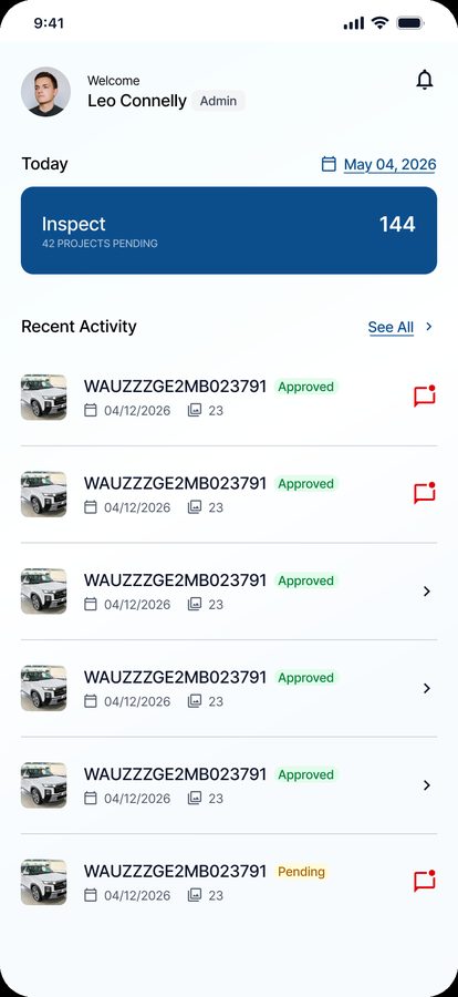
The home screen answers: what needs my attention, what is in progress, and what is done? Work is grouped by status so the most urgent project surfaces first.
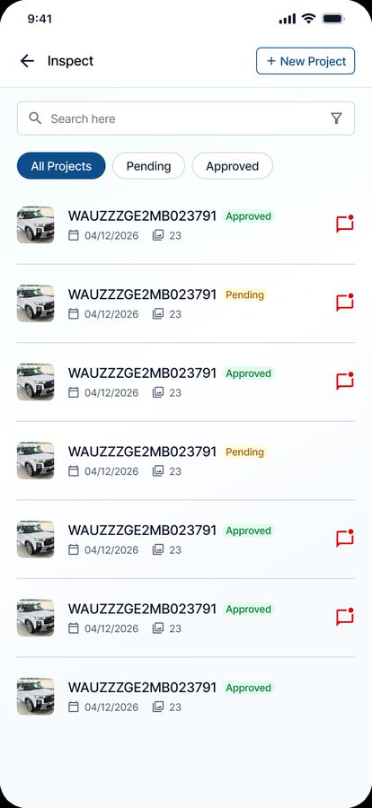
A searchable list separates All, Pending and Approved, with each row carrying the VIN, date, photo count and a status chip — plus a feedback indicator when QC has commented.
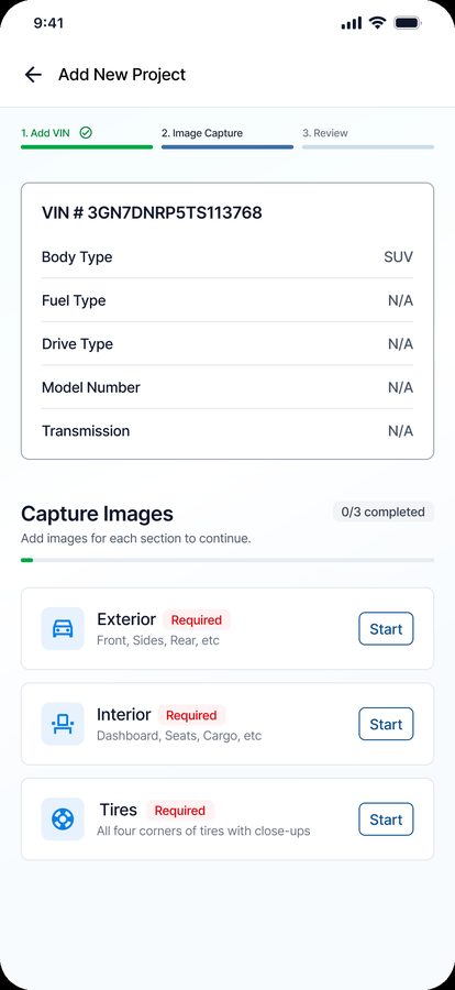
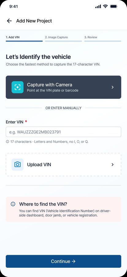
Adding a project starts with the 17-character VIN. Camera capture is the fastest path; manual entry with inline validation is the fallback, with plain-language help on where to find the VIN.
Before capture, a compact vehicle summary and a three-section progress map build a strong mental model. Each category shows required shots, completed shots and any issue state.
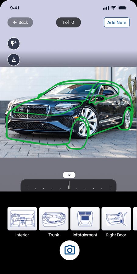
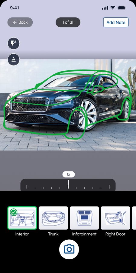
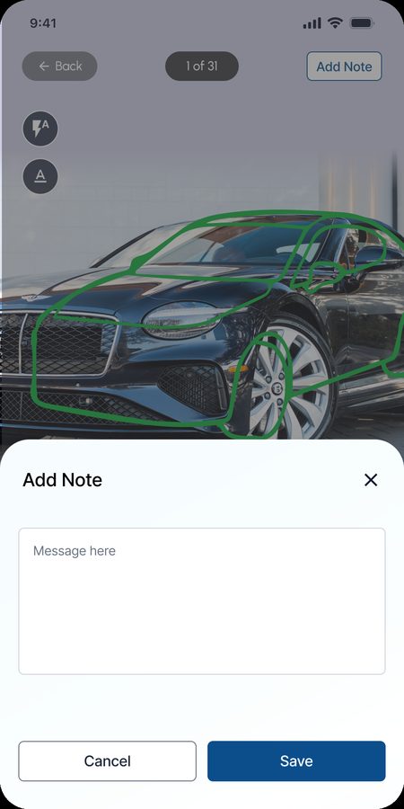
The camera keeps the active category and shot position visible at all times. A reference overlay helps users align the vehicle with the expected perspective, supporting recognition instead of recall. An Add Note flow lets inspectors flag context without leaving the frame.
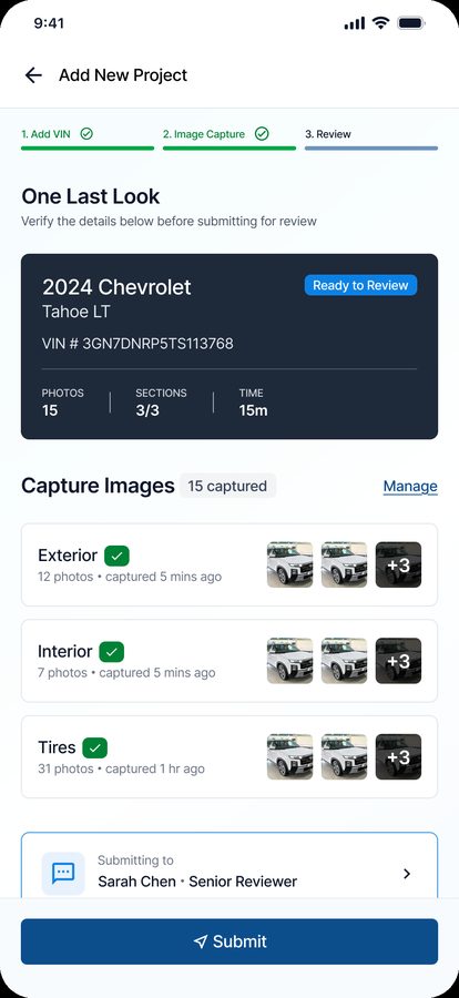
A dedicated review step summarizes every required image and surfaces anything missing or unresolved before Submit becomes available. Confirmation explains exactly what happens next: QC review.
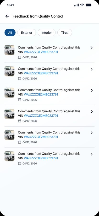
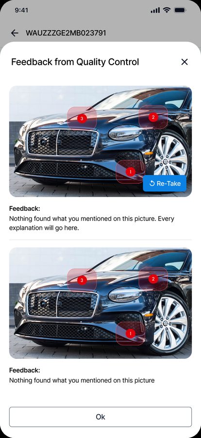
When QC rejects an image, the project moves to Needs Retake, the affected image is highlighted, and the user sees a standardized reason plus an optional admin note — with the original image kept visible for comparison and a single Retake action.
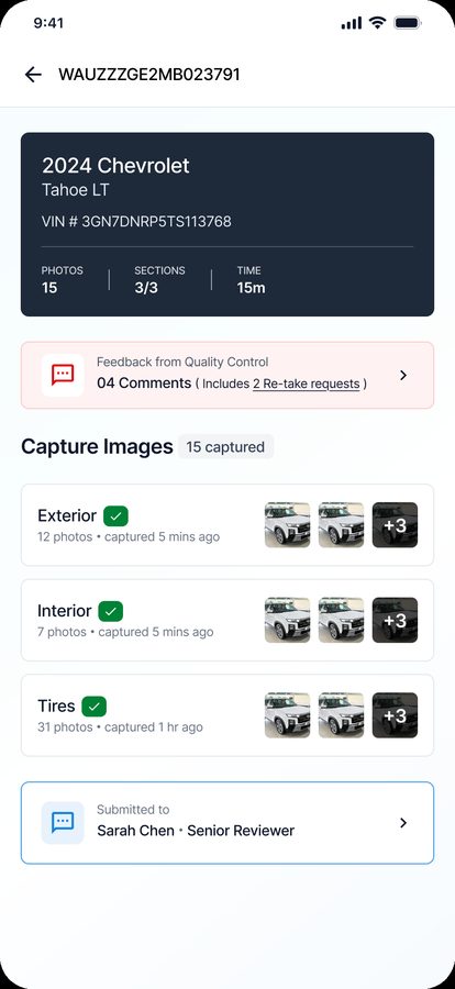
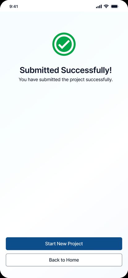
Needs Retake surfaces the exact card requiring action, and a clear success state gives the completion closure the old flow lacked — with a fast path to the next assignment.
11 / Usability validation
A moderated round confirmed the redesign reduced interpretation and rework, and pointed to a few refinements.
Made the active category label larger and persistent in the camera header; moved the QC reason above the free-text comment so the problem is recognizable at a glance.
Replaced generic "Continue" CTAs with context-specific labels: Start Exterior, Review Photos, Retake Photo, Submit to QC. Added a pre-start progress summary and increased outdoor contrast on camera controls.
12 / Design system
A tokenised system across colour, typography and components — built so behavior is predictable and learning transfers between screens.
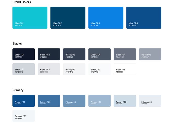
Brand, neutrals, primary ramp and semantic states across nine families.
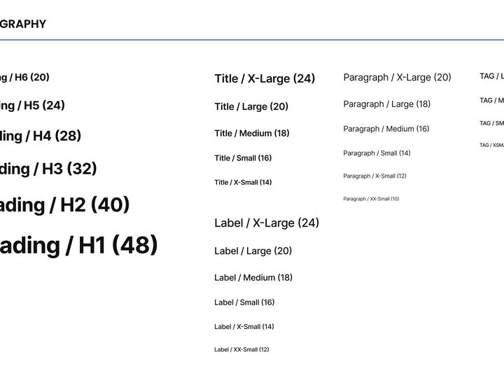
Bricolage headings with an Inter product scale, H1 through Tag.
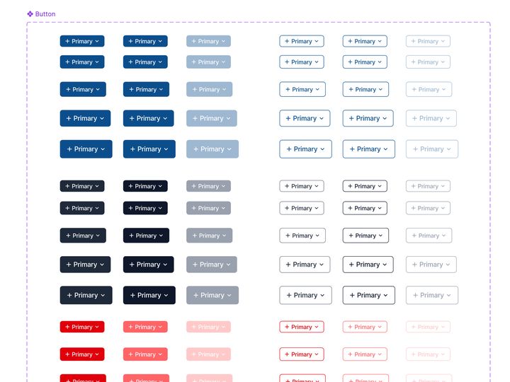
Variants, sizes and states with icon and dropdown affordances.
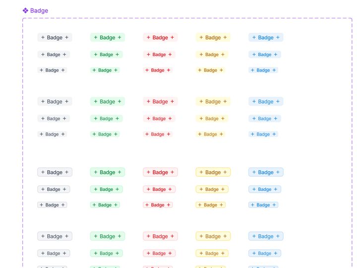
Soft and solid status badges across every semantic colour.
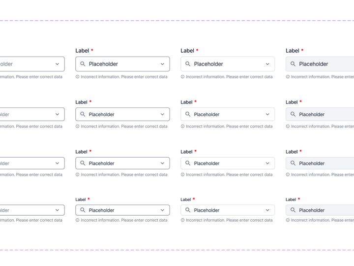
Default, focus, filled, error and disabled field states.
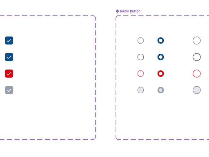
Unchecked, checked, error and disabled selection states.
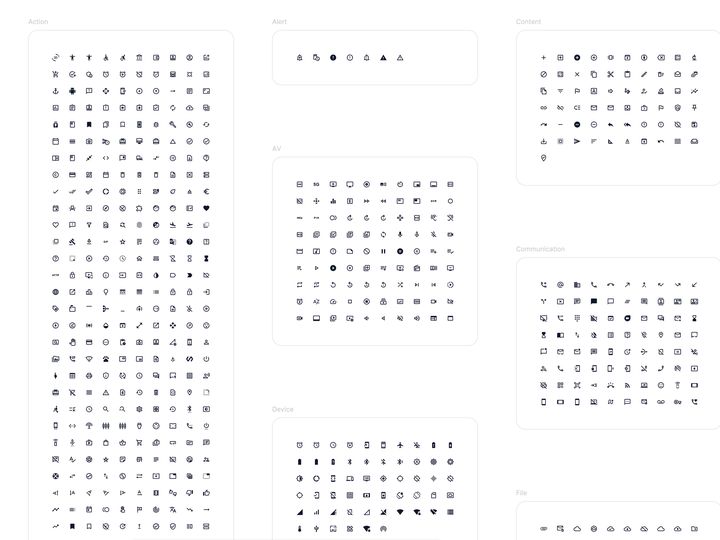
A consistent stroke icon set spanning action, alert, AV and device.
Colour, type, spacing, radius and touch targets as semantic roles.
Buttons, badges, inputs, checkboxes and radios with states by default.
Capture, review, feedback and retake behave the same across the app.
"Retake photo," not "Resolve asset." Actions read the way users speak.
Words paired with icons and thumbnails; status is never colour alone.
Primary controls and critical states stay legible in bright light.
Camera, next, retake and submit use generous 44×44pt hit areas.
Incomplete submission is blocked, with an exact list of what's missing.
Progress is preserved when connectivity drops, with a visible sync state.
~16px body minimum; important instructions avoid low-contrast grey.
No text baked into illustrations; layouts flex for translated labels.
13 / Impact
The redesign improved both completion and speed — an operational win as much as an experiential one.
From 44.3% to 91% — more than doubling the prior completion rate.
Average completion fell from ~9.4 minutes to ~3 minutes.
Less active task time per inspection, at higher volume.
Task completion increased from 44.3% to 91%, and average project time dropped from roughly 9.4 minutes to about 3 minutes. The impact compounds: faster, more complete inspections mean more vehicles move through the workflow with fewer inspector retries and fewer QC cycles.
14 / Reflection
The single decision that made everything else fall into place — and what I'd build on next.
The strongest decision was to stop treating the app as a collection of screens and model it as one operational loop. Once that loop was explicit, the information architecture, navigation, feedback states and component system could all support the same mental model.
For field inspectors, "intuitive" did not mean sophisticated interactions or dense dashboards. It meant seeing the right vehicle, the right category, the right angle, the right next action — and, when something went wrong, the exact reason and recovery step.
The revamp created value by reducing interpretation. The product became faster because users spent less time understanding the interface and more time completing the inspection correctly.
Have a product challenge?
Healthcare, AI or SaaS product with a high-friction workflow? I help teams turn complexity into confident decisions and measurable outcomes.